

Kích Thước Dây Đeo Thẻ Tiêu Chuẩn Hiện Nay: Lựa Chọn Nào Phù Hợp Cho Doanh Nghiệp?
Trong môi trường công sở chuyên nghiệp hay tại các sự kiện quy mô, dây đeo thẻ không chỉ đơn thuần là một vật dụng để giữ thẻ nhân viên hay thẻ khách mời mà còn đóng vai trò như một công cụ nhận diện thương hiệu đắc lực. Việc lựa chọn kích thước dây đeo thẻ tiêu chuẩn phù hợp không chỉ mang lại sự thoải mái cho người sử dụng mà còn quyết định đến khả năng hiển thị thông tin, logo của doanh nghiệp. Công ty Dây đeo Trường Thịnh, với nhiều năm kinh nghiệm trong lĩnh vực sản xuất và cung cấp dây đeo thẻ, xin chia sẻ những thông tin hữu ích giúp bạn dễ dàng lựa chọn kích thước tối ưu nhất.
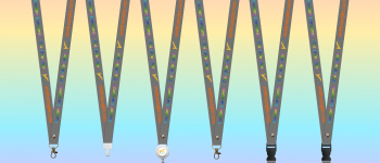
Chiều dài tiêu chuẩn của hầu hết các loại dây đeo thẻ trên thị trường hiện nay là 900mm (90cm). Đây là kích thước đã được nghiên cứu kỹ lưỡng, phù hợp với vóc dáng trung bình của người Việt Nam cũng như quốc tế. Khi đeo vào cổ, phần thẻ sẽ nằm ở vị trí vừa tầm nhìn, thuận tiện cho việc quẹt thẻ kiểm soát ra vào, đồng thời giúp người đối diện dễ dàng đọc được thông tin trên thẻ mà không gây cảm giác vướng víu hay khó chịu.
Hai Kích Thước Bản Dây Thông Dụng Nhất
Sự khác biệt chủ yếu giữa các loại dây đeo thẻ nằm ở chiều rộng (bản dây). Hiện nay, có hai dạng kích thước bản dây thông dụng nhất được các doanh nghiệp ưa chuộng:
Kích thước 15mm x 900mm – Thanh Lịch, Văn Phòng
Kích thước 15mm x 900mm là loại dây đeo thẻ có bản rộng vừa phải, mang lại vẻ ngoài thanh lịch, tinh tế và không quá phô trương. Kích thước 15mm cung cấp đủ không gian để in ấn tên công ty, logo nhỏ hoặc một câu slogan ngắn gọn. Loại dây này đặc biệt phù hợp với môi trường văn phòng công sở truyền thống, nơi đề cao sự gọn gàng, lịch sự.
Kích thước 20mm x 900mm – Nổi Bật, Quảng Bá Thương Hiệu
Kích thước 20mm x 900mm mang đến một diện tích hiển thị rộng rãi hơn hẳn. Đây là lựa chọn tối ưu cho những doanh nghiệp muốn tối đa hóa hiệu quả quảng bá thương hiệu. Với chiều rộng 20mm, bạn hoàn toàn có thể in ấn logo công ty với kích thước lớn, kết hợp cùng slogan, địa chỉ website hoặc số điện thoại một cách nổi bật và dễ thu hút sự chú ý của người nhìn.
Bảng So Sánh Các Kích Thước Dây Đeo Thẻ
| Kích thước | Bản rộng | Ứng dụng phù hợp | Khả năng hiển thị |
|---|---|---|---|
| 15mm x 900mm | Hẹp, thanh lịch | Văn phòng, công sở | Logo nhỏ, slogan ngắn |
| 20mm x 900mm | Rộng, nổi bật | Sự kiện, hội chợ, kinh doanh | Logo lớn, đầy đủ thông tin |
| 10mm x 900mm | Rất hẹp, nhỏ gọn | Học sinh, sinh viên | Tên trường, mã số |
| 25mm x 900mm | Rất rộng, ấn tượng | Sự kiện đặc biệt | Thiết kế phức tạp, nhiều màu |
Các Yếu Tố Cần Cân Nhắc Khi Chọn Kích Thước
Khi quyết định chọn kích thước dây đeo thẻ, doanh nghiệp cần cân nhắc kỹ lưỡng dựa trên các yếu tố: mục đích sử dụng (đeo hàng ngày tại văn phòng hay dùng cho sự kiện), đặc điểm thiết kế logo (logo phức tạp hay đơn giản), lượng thông tin cần in ấn và cuối cùng là ngân sách dự kiến. Một thiết kế đẹp mắt trên một kích thước dây đeo phù hợp sẽ góp phần nâng tầm hình ảnh chuyên nghiệp của công ty bạn.
Ngoài hai kích thước tiêu chuẩn trên, trên thị trường còn có các loại dây bản nhỏ 10mm (thường dùng cho thẻ học sinh, sinh viên) hoặc bản lớn 25mm (dành cho các sự kiện đặc biệt cần in ấn nhiều thông tin). Tuy nhiên, 15mm và 20mm vẫn là hai sự lựa chọn phổ biến và mang lại sự cân bằng tốt nhất giữa tính thẩm mỹ và công năng sử dụng.
📞 Tư Vấn & Đặt Hàng Ngay Hôm Nay
Với đội ngũ tư vấn viên nhiệt tình và xưởng sản xuất hiện đại, Công ty Dây đeo Trường Thịnh cam kết mang đến sản phẩm chất lượng cao, kích thước chuẩn xác và thiết kế ấn tượng nhất.

